Fri 19 Feb 2010
Quantitative and qualitative
Posted by NancyF under Quantitative, User & Customer Research
No Comments
 User researchers know that it’s possible to analyze qualitative responses with quantitative methods, given enough responses.
Research methods are divided into various categories. One familiar distinction is the qualitative and quantitative. Sometimes we think of these categories as distinct types of research: Â either-or. A research project collects qualitative data (e.g., an interview with questions that invite open-ended responses) or quantitative data (e.g., a survey with multiple-choice, true-false, or scalar responses). Or is it that the analysis uses qualitative methods (affinity diagrams) or quantitative methods (statistical packages)?
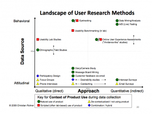
Christian Rohrer suggests that qualitative research methods are more likely to involve direct engagement with users, while quantitative are more likely to involve indirect techniques, but that these methods live along a continuum: Â more or less, not either-or.
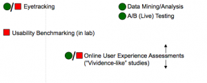
The diagram below maps out Rohrer’s ideas about this continuum. Â (Click the image to enlarge.)
Registration form entries are subject to quantitative analysis
Here’s a case where my colleague and I interrogated a database of responses from roughly 10,000 people using simple quantitative methods. While it’s not data mining with datasets the size that Google or Yahoo! might have, it certainly is a type of data mining – see the upper right corner of the diagram.
Our client’s website offered a weekly newsletter for people involved in affordable housing and community development. For research purposes, we had access to the information from registration forms of prospective subscribers. The form contained at least 4 fields of interest to us, as we confirmed (or revised) our ideas about who was using the original website (Knowledgeplex.org) and its companion site (Dataplace.org) combining geographical data with statistics collected from the US federal government. Besides giving an email address, people who registered were asked to include their job title and the name of their employer, and to select from a list of fixed roles which role(s) fit them best.
We were able to make inferences about users and uses from this large database of qualitative and loosely structured information, in conjunction with other more familiar (qualitative) user research methods (interviews, usability studies). For example, we could show that Researchers (an amalgam of several job titles and roles) were more likely to register through Dataplace, the site with interactive maps and statistics, than at Knowledgeplex, the site with news and policy updates.
We described the work for an audience of peer researchers, at a workshop at CHI 2007. Now some 3 years later, the funding for Knowledgeplex and Dataplace has ended, development has stopped, the sites have been taken down, and evidence of our contributions to this work are even more difficult to document and track. The conference report contains less detail than the report we provided to the client. And yet it gives the flavor of turning qualitative data (job title, organization name) into quantifiable results (Researcher registrations are growing more quickly on one site than the other), confirming that we were indeed headed in the right direction in attracting the audience we hoped to reach for each of these companion sites.
Christian Rohrer’s Landscape of User Research Methods: Slide 20 from the (.pdf) of Rohrer’s presentation to BayCHI.  His blog post about this experience includes a link to the full set of slides: Christian’s Greatest Hits
CHI 2007 Workshop Website: Â Imaging the City: Â Exploring the Practices & Technologies of Representing the Urban Environment in Human-Computer Interaction
Our contribution: Â CHi2007DataPlace-workshop-3 (.pdf download, 336K) (also available from the workshop website)

No Responses to “ Quantitative and qualitative ”